Throughout this module I think I have developed a variety of new strengths and skills. The main difference I found in myself was using computer programs more, in both the YCN brief and the brief I chose myself I have been working out of my comfort zone (hand drawn illustrations) and I have been doing a lot of vector work. I have really enjoyed working in a different ways to than normal and from doing this a have produced a new range of work.
I found collaborating for the YCN brief extremely beneficial. I really enjoyed working with my partner and we both pushed ourselves to keep doing more and more work. My partner and I were well suited and we agreed on all our ideas and wanted the outcome to be the same. If I was to collaborate with someone whose ideas were different than mine I don’t think I would have enjoyed it as much.
At the beginning of the second brief, which we wrote ourselves, I struggled to get going and didn’t know where to start. I found crits and tutorials very helpful and then I really got in to my work. I think I have produced a range of ideas and products and although my outcomes aren’t perfect I am pleased with results.
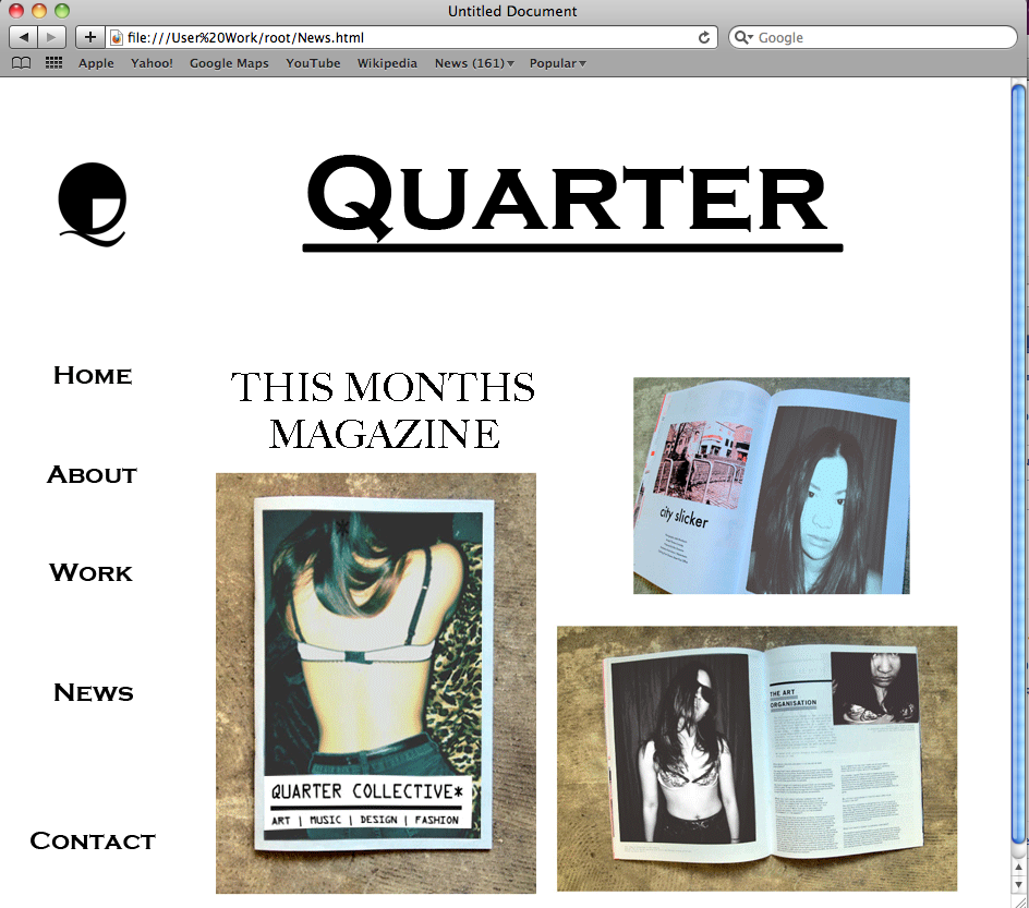
The weakest part of this module was the web design. I really enjoyed the classes and found myself not getting lost or not understanding it. However even though I wrote a lot of note when I came to do it myself I had completely forgotten everything. When I finally got to grips with Dreamweaver I found myself enjoying making a website. I think I would have produced a better website if I had taken more time over it and be more inventive.
I often struggle with type and always seem to get it wrong so in the brief I wrote myself I tried and tested a lot more type than I usually do and for once I feel like the type fits with the image.
If I was to write my own brief again I think I would give more thought to the subject matter and do something more personal. Even though I like the work I have produced and I like the album I chose, I would chose an album that reminds me of myself.
Three things I would do differently next time:
1. Consider time and resources available to me.
2. Be more adventurous with work and media.
3. Taking better photographs of my work for documenting.
Attendance 5
Punctuality 5
Motivation 4
Commitment 5
Quantity of work produced 4
Quality of work produced 3
Friday 27 May 2011
website
I really enjoyed the web design classes and thought I was picking it up well. However when I came back to do it on my own I had forgotten everything and the notes I took didn't seem to help. I figured it out after a while but kept the same layout that we learnt in class. If I had time I would like to do a different arrangement of the tables.


I managed to make a lightbox. This is where you have thumb nails of photos and they are enlarged when you click on them. This was very hard at the beginning and I was about to give up when I realised I hadn't actually downloaded it, I was just trying to copy the code across. I'm really pleased I figured out how to do this and it works well on the page.
I also changed the font of the lightbox in photoshop to make it look as thought it went with the page.

Thursday 26 May 2011
album and singles
Printed off vinyl and cd's.


Problem with the printer!
I wish I had another chance to print these off as they haven't turn out how I would like them to be. Firstly the cover of Flying to Tokyo has a mistake on it. I had hid the layer on photoshop and in the print room the man unhid it not realising I wanted it to be hidden, so there is a big magnet where there shouldn't have been. However I also managed to get the size of the cd cover wrong for Flying in to tokyo and it is too small.
Another problem was that I thought I would be able to print off in A1 when I booked my slot in the print room, but it was fully booked and I was only allowed to do it in A2. However this isn't too much of a problem as you can buy smaller sized vinyls but I would have preferred it to be 30cm by 30cm.
tickets
These are my final tickets printed off. I decided to keep all 3 colours, as they can be used for different gigs.
I printed them on satin paper to look more like a tickets

Wednesday 25 May 2011
Skate board
My friend is a big fan of magnetic man and asked to see some of my designs which he thought fitted with the artist.
The next day he said that he liked my tokyo design so much that he'd have it on his skate board.
 Then I realised that a lot of people who are in to this genre of music skate board and I should come up with some designs to put on the website.
The next day he said that he liked my tokyo design so much that he'd have it on his skate board.

Tuesday 24 May 2011

packaging


These are my packaging for the singles. I need to make to same packaging but vinyl size for my album.
I need to make everything I make look like a set so I have kept the same background that I used for the posters.
new posters
From the feedback I received from the crit I can see how the background in my poster were too busy and took attention away form the image. I decided to make the background smaller and just gold without a grey background. I think this has worked as your attention is not focused on the busy background and it looks more like wallpaper than an image. This keeps attention on the actual image.


Monday 23 May 2011
Poster to print
These are going to be my four final posters that I am going to print off. In my crit and my tutorial I was told to make them look similar so that they look like a set. I think I have achieved this by making the background the same, the colours and the the font matching throughout.


poster background


website design for magnetic man
This is a mock up of how a website for magnetic man would be, giving information on the album, how to buy the t-shirts, upcoming events and tickets.


Friday 20 May 2011


gig ticket

This is the first gig ticket I have produced. I had been looking at work where backgrounds had patterns in them and thought I could use the magnet and the headphone from Magnetic mans album cover I have made and collage them and turn down the opacity. I am really pleased with the out come but I haven't experiment with different styles so I can not say this is my final ticket.
Thursday 19 May 2011
Sizes of the CD's and vinyl
I really hate plastic cd covers that end up breaking and the plastic getting scratches on. So I have decided that I am gin to make one big sleeve for the vinyl and 3 small ones for the cd, this way they look like a set and I don't have to put them in awful plastic covers.


Subscribe to:
Posts (Atom)