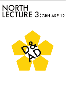
yellow and black works
can see what it is about straight away
answers the brief
spelling mistakes need changing
black background works better than the white
could make the date stick out more as it is more important that some of the smaller details
Tuesday, 27 September 2011
Final Poster and other peoples work
I decided to print both of the posters below off and not any of the other, I wasn't really please with my work on this brief, I think I was trying to hard to create a style that wasn't me, which made my work look rather unprofessional and I think it was a bit agressive.
Looking around the room I can see that a lot of people have incorporated there on style on to the brief and have not stuck to the D&AD colours or style. There are a lot of variations form photography to vectors and a range of colours. However the people who have not stuck to the D&AD colour might find that people won't instantly know what they are trying to comunicate where as the people who have poster look very obvious with is a good thing for a poster as you need to catch attention and get to the point straight away. Now I have seen everyone else I am hoping I might have time before thursday to create a poster which resembles me a bit more, im not looking forward to the feed back on my work.
Looking around the room I can see that a lot of people have incorporated there on style on to the brief and have not stuck to the D&AD colours or style. There are a lot of variations form photography to vectors and a range of colours. However the people who have not stuck to the D&AD colour might find that people won't instantly know what they are trying to comunicate where as the people who have poster look very obvious with is a good thing for a poster as you need to catch attention and get to the point straight away. Now I have seen everyone else I am hoping I might have time before thursday to create a poster which resembles me a bit more, im not looking forward to the feed back on my work.
Another Poster
I have just created another poster which I think works well, it is simple but effective... I think I should try some variations of it but this is what I have so far.
After playing around I found it difficult to make any changes and what I did manage to change I didn't think look as affective as there was too much going on.
I changed the background to black and the writing to yellow.
After playing around I found it difficult to make any changes and what I did manage to change I didn't think look as affective as there was too much going on.
I changed the background to black and the writing to yellow.
another try
Realised that on the poster before I had made the wrong shape for the d&ad symbol, this should be the correct symbol....
I have changed one of my poster and added the correct symbol.
I have changed one of my poster and added the correct symbol.
Monday, 26 September 2011
Maybe an option
D&AD poster Trial
Not all the information is that is required is not yet on the poster and a lot more work needs to be put in to them as I think they either look too simple or have too much going on.
A poster brief for D&AD North Lecture 3: GBH are 12
To celebrate the third D&AD North Lecture of the series- and the first series to be held in Leeds we have been as to design an idea for a promotional poster.
The poster needs to promote a multi award winning design and advertising agency GBH.
The information that needs to be on the poster:
event title: D&AD North Lecture 3: GBH are 12
Wednesday October 5th 2011
Doors open 6pm. Lecture starts 7pm
Rose Bowl Lecture Theatre,
Leeds Metropolitan University,
Portland Crescent, Leeds
Ls1 3HB
Friday, 23 September 2011
Book Fair Ideas
After doing some research I can see that I am favoring animal mask and masks that look a bit evil/dark. I think I will explore with some drawings of evil animals and see where they take me.
START OF YEAR 3....Manchester Book Fair
Manchester Book Fair deadline date is on the 22nd October. I have dont book fairs before but we were always given a theme and a brief to follow. This year we are allowed to come up with our own brief meaning I could create one big book or a few book.
I have decided I want to make a book of pullout masks.
I have decided I want to make a book of pullout masks.
The 4 Briefs I have chosen
The are the 3 Briefs I have chosen, I have already started the manchester book fair but this is the Briefs written up, I am waiting to pick my four brief as I would like to pick a YCN brief but the new ones have not been released yet.
BRIEF 1
BRIEF 1
Compotition Brief
Brief 4 M&S perfect picnic
Subscribe to:
Comments (Atom)


