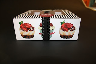
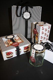
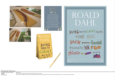
I have developed my illustration skills and applied it to all my briefs. I feel I have managed to create a range of styles throughout the module. I have learn to do more with my illustrations, rather that just an image I have learnt how to make use of them and not just be a 2D image.
I have organised my time very well this module, knowing from week to week what needs to get done, this has left me calm and stress free.
2. What approaches to/methods of research have you developed and how have they informed your design development process?
I have visited some Galleries in London and picked up leaflet and business cards from everywhere. The most inspirational research is when I went to Manchester Book Fair as I loved all the stalls and took so many business cards and look people up. I can see myself doing this in the future so I took in a lot of information.
As for the extent of my research, at the beginning of the modle I feel my research lacked, I was doing it but I wasn't looking far for inspiration or in much depth. At the time I felt that any research I did fro my 1st project would influence my work. However as the module went on, I picked up on the research. I found for my forth brief, we got good result because we spent time, researching many topics and researching in depth to our chosen topic.
3. What strengths can you identify in your work and how have/will you capitalize on these?
I can see that my work is not just a drawing or a pretty picture, but I am putting my work in to context, I believe my illustrations are strong, I have been working on my type skills but I can see they are not as good as some other people, I feel if I get the type write I could produce some really exciting work.
I am so impressed at myself with my organisation skills and not forgetting about one project so it fall behind but keeping them all up and running. I will follow the same structure in the future so I can get my best work done in the time available.
4. What weaknesses can you identify in your work and how will you address these more fully?
I can definitely see how my type and layout lets my work down so much, it really annoys me that I cant just get it as I thought with time it would become better, I really need to collaborate even if I dont like it. I seem to rush in to idea straight aways as I want to create images and it makes me feel like I am not behind, this means missing out vital research, I can definitely say that my ideas could have been better and pushed further if I hadnt of rushed straight in to drawing and creating and thought more about how far I can push the brief and what will make it exciting for myself to do rather than getting too repetitive and running out of ideas. I am going to stop rushing in to design in the future and choosing one idea and going with it, but think about what I really want to do and research.
5. Identify five things that you will do differently next time and what do you expect to gain from doing these?
- research in depth
- think of the outcome and why I am designing the work
- collaborate with someone who does type or get better myself
- use more methods of printing- i always say I want to screen print and never do, and lazer cutting looks like fun,
- make work that I want to buy myself or have myself
6.How would you grade yourself on the following areas:
5= excellent, 4 = very good, 3 = good, 2 = average, 1 = poor
Attendance - 5
Punctuality - 4
Motivation - 5
Commitment - 4
Quantity of work produced - 4
Quality of work produced - 3
Contribution to the group - 4


