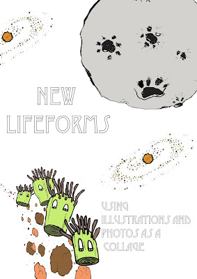
I have been looking at other kids channels and one that i thought might fit very well was an american cannel called discovery kids and national geographic kids which has animal and nature fun facts.
Monday, 31 January 2011
idents idents idents
I still havn't really started looking at my idents and need to decide on a lot of things. Firstly what channel my program is going to be on. I have been thinking as its for children, BBC1 or 2 early in the morning, so maybe on CBBC. I also thought of some other channels such as early morning channel 5 milkshake as I can remember watching quite a few interesting programs as a child. There is also CITV.
image feedback/evaluation
After showing my 3 A1 posters to a group i received some useful criticism and compliments.
Firstly they said that my work was affective as they didn't even want to look at the "infection" poster, which show how my typeface works. However they said that the background didn't really go with the work and I should think about changing it to something that is not white.
The batteries was the most liked but quality of line was poor in some places and i should think about scanning my work it and touching it up on other programs, the positioning was another point raise and i should try and play the word on a different part of the page.
The last piece was "back of there heads" this was my least favourite piece but received good and bad criticisms, the main issue raised was that a darker like maybe should have been used and more detail in the hair.
Thursday, 27 January 2011
Wednesday, 26 January 2011
image-relationship maths
Tuesday, 25 January 2011
infections
image module
Monday, 24 January 2011
Planet fonts
I went on a website i found online and found more fonts that are to do with planets.
However I don't think that any of these really go with my type of illustrations.....even tho I was going to hand draw my type anyways i wanted a guide from a real font. I think i'll have a go at creating my own by hand and then decided on a style and see if any fonts on photoshop are similar to help with how my letters should go.


FONTS

Here are some other idea, Im sure I need to look at a lot more as these are the ones that i was looking at in photoshop, i need to go on some websites and download and find a lot more.
Change of Plan


 After my crit feedback from my 3 boards, I had comments about how some of my illustrations where coloured in by hand and how some i did by live tracing on illustrator and then putting them in photoshop and adding colour. After my crit I asked the people who looked at my work which one they thought I should do and they agreed that they liked the hand coloured in images but weren't sure if i would have enough time to do them. However i think it takes jut as long colouring them in on the computer. So the images above will soon be shown on my blog as hand coloured in images.
planet land tester
this is a video I have made of part of my title sequence. In my title sequence i want to zoom in to lands/planets that I have created.
Untitled from Elizabeth Ibbotson on Vimeo.
Friday, 21 January 2011
planet tester video
made a very short 5 second video just to see if my planets worked and if hey look okay.
I think i like what i've made. now on to a bigger one.
Untitled from Elizabeth Ibbotson on Vimeo.
image module
the three quotes i have chosen are-
- "Infections and illnesses" from doctor doctor article
- either "sleep more" or "my displeasure" from Tim Dowlings article
- "have a life" from Relationship maths article
These quotes are what I think I am going to do but I am not 100% sure yet.
ideas
Relationship maths- making the letters and words out of numbers and hearts.
or something like this...

For Doctor doctor i would like to make the type look like an infection in itself and as gross as possible .
For Tim Dowling I have thought about "sleep more" and writing it almost everywhere and taking photos of them.
planets
3 ARTICLES WITH IMAGE

Here i thought i would keep my illustration very simple as there is a large photo already on the page. I made a very cute looking flu bug which is ill.

I really liked this article and anted to go loads for it. I decided on the part about him shouting at a cat and drew this illustration and then colour it in on photoshop.

I found this one really hard, I had know idea what to draw at first. However i really like my outcome and thinks it works best in black and white. I like how i have made it scribbly, i was trying to make it look like some of the illustrations that you get in news papers.
Thursday, 20 January 2011
Subscribe to:
Comments (Atom)


